I just thought I’d quickly share how to use CSS to set up fluid typography. By that I mean:
Fluid typography is text which size adapts … erm … fluidly to a device’ screen width.
I was recently inspired by this great post on the subject by Michael Riethmuller. After reading the post I set out to realize it on a WP Theme project that I am currently working on (more on that at some other point). And this is what I aimed to achieve:
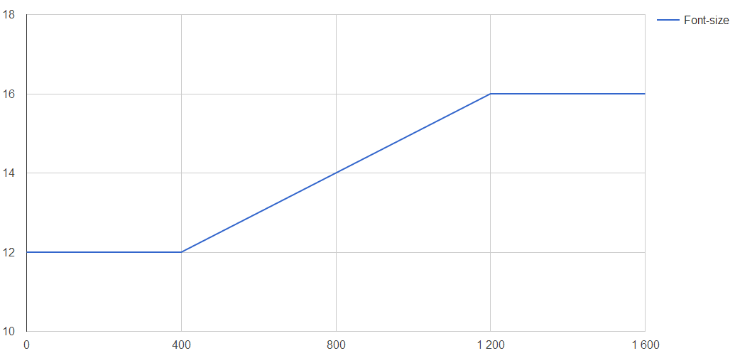
For devices less than 400px wide, font-size should be 12px
For devices more than 1200px wide, font-size should be 16px
In between 400 and 1200px, font-size shoudl increase linearly
Like this:
To do this, I use the following CSS
html {
  font-size: 12px; // Default
}

/* Modern browsers fluid typo */
@media screen and (min-width: 400px) {
  html {
    font-size: 14px; /* Fallback for older browsers */
    font-size: calc( 12px + ( ( 16 - 12 ) * (100vw - 400px) / (1200 - 400) ) );
  }
}
@media screen and (min-width: 1200px) {
  html {
    font-size: 16px;
  }
}
Basically, it is the calc() function that does the trick. Calc simply does any calculation that you specify. Also, I make use of the vw-unit where 100vw translates to 100% of the viewports width, in px.
Written out and simplified it states:
12px + ( 4 * (ViewportWidth - 400px) / 800 )
To see how this will pan out, we can look at how different ViewportWidths
600px -> 13px
800px -> 14px
1000px -> 15px
That’s what I call fluid typography! I hope that this will help some of you to also take advantage of this sweet way of scaling text!
phpDocumentor is a tool to generate documentation directly from your ´php´ files. This short post will tell you how to set it up on your Windows machine using XAMPP and pear.
Step one is to install XAMPP. Fire it up, and hit the button “Shell” in the GUI.
Test Driven Development is one of the best strategies for building solid WordPress plugins that are easy to maintain and that is bootstrapped to live a long life in the WordPress ecosystem. There are many variations as to how to implement the approach, but they all have a common principle: Define tests first, then code.
So the first step before starting WordPress plugin development is to get a test environment up and running. This article will cover how to get ready for Unit testing on a local XAMPP development server using PHP Unit.
First, a short definition of unit test that I’ve paraphrased from the Wikipedia article on the topic
a software testing method by which individual units of source code, i.e. the smallest testable part of an application, are tested to determine whether they are fit for use.
In plugin development this usually would be methods or functions.
This article will cover
Installing XAMPP
Installing PHPUnit
Setting up unit tests in a WordPress plugin directory
Installing XAMPP and PHPUnit
This is the easiest part of this small tutorial. Head on over to Apache Friends and download a copy of the XAMPP installer. PHPUnit ships with XAMPP, so once installed, you have both installed. Follow the installation Wizard to set it up on your computer. The rest of the article assumes that XAMPP has been installed in c:/xampp. Next, add the XAMPP PHP directory to the path variable. The directory would be c./xampp/php. To verify that phpunit is properly installed, open up the command line and type
phpunit –version
The expected result would be
PHPUnit X.Y.Z by Sebastian Bergman
Set up the files needed to run plugin unit test
The rest of this article covers how to get and set up the files needed to run WP unit test.
Final directory setup:
phpunit.xml
tests
wordpress-tests-lib
includes
<Files from WP unit test>
src
<Source of wordpress>
wp-tests-config.php
bootstap.php
test-*.php
Create the directory structure needed
All tests and associated files will be located inside the plugin folder. To start with, create a directory within your plugin called tests, and then a subdirectory called wordpress-tests-lib. Tests will be the main folder where all test cases will be located. WordPress-tests-lib will contain the libraries that we depend on to do WordPress unit tests. Lets start with those.
Get the unit test scripts from the WordPress development repository
The first thing needed is the scripts that are used to do WordPress unit tests. These are located in the development repository in the tests folder. To download the files, use the following subversion command.
svn co https://develop.svn.wordpress.org/tags/4.4.2/tests/phpunit/includes/ tests/wordpress-tests-lib
Also, get the config sample file, and store it in tests/wordpress-tests-lib as wp-tests-config.php. Replace the database info at the bottom with your own. Make sure that the database you provide is empty.
Setup PHPUnit to run tests
The first ting you need is the phpunit XML file that tells PHP unit where your tests and your scripts are. I reccomend getting a copy of the config file used by WP-CLI and store it as phpunit.xml in your plugin directory. The file points to a file called tests/bootstrap.php. This is a link to the file that bootstraps your plugin for testing. This file should look something like this.
Basically, what it does is that it required the WordPress test scripts and plugs the plugin into a hook to make sure it is loaded.
Write a test, and you are ready to go
All tests should be kept in files named test-SOMENAME.php in the tests folder. An example test would look like:
<?php

class SampleTest extends WP_UnitTestCase {

 function test_sample_true() {
 // replace this with some actual testing code
 $this->assertTrue( true );
 }

 function test_sample_false() {
 // replace this with some actual testing code
 $this->assertTrue( false );
 }
}

?>
Run the test by executing running phpunit in your plugin folder.
A few days ago, I released a web app that I’ve called .gdoc Structure Viewer. The simple app lets you inspect the internals of any Google Docs file. It’s meant to be a tool for developers.
How does it work
The web app is pretty simple it is a tree-viewer of the elements within the Google Docs file. My current project had me converting gdoc to json format, and at some point I got tired of copy-pasting the json data into a tree-viewer. Anyways, I extended the script a bit and wrapped a web-app around it – and out came the .gdoc Structure Viewer. Hope that someone other than me find it useful when working with Docs in Google Apps Script.
A couple of days ago, i published a post on how to do responsive video embeds in a WordPress loaded with Bootstrap. This post is a continuation of that process. If you read the other post you might remember that getting the aspect ratio of the video is what I didn’t do. So, that is what I’ll do today – and it will lead to the best practice way to properly responsively embed videos in WordPress. The code relies on the CSS from the Bootstrap-component Responsive Embed – if you are not using Bootstrap, simply include that code in your CSS.
Starting with oEmbed
WordPress relies on oEmbed when embedding external video content onto your site.
oEmbed is a format for allowing an embedded representation of a URL on third party sites. The simple API allows a website to display embedded content (such as photos or videos) when a user posts a link to that resource, without having to parse the resource directly.
That’s pretty neat. The oEmbed code is contained within the file class-oembed.php. It handles oEmbed recognition, calls, processing and more. And within it is what we need to make the best responsive video embed for WordPress. On line 501 there is a function data2html that turns oEmbed data into html code. And the best part is that it applies a filter hook at the end, apply_filters('oembed_dataparse',$return,$data,$url). And it passes the oEmbed data to the filter – and that is what we need.
oEmbed data
So, what does this oEmbed data look like? Lets look at a couple of sample results from YouTube and Vimeo (click the links to see what the oEmbed call receives).
    "provider_url": "http://www.youtube.com/",
    "title": "Ylvis - The Fox (What Does The Fox Say?) [Official music video HD]",
    "thumbnail_url": "http://i.ytimg.com/vi/jofNR_WkoCE/hqdefault.jpg",
    "thumbnail_width": 480,
    "author_name": "TVNorge",
    "height": 270,
    "version": "1.0",
    "thumbnail_height": 360,
    "width": 480,
    "author_url": "http://www.youtube.com/user/tvnorge",
    "provider_name": "YouTube",
    "html": "<iframe width=\"480\" height=\"270\" src=\"http://www.youtube.com/embed/jofNR_WkoCE?feature=oembed\" frameborder=\"0\" allowfullscreen><\/iframe>",
    "type": "video"
}
As seen, the response is pretty much the same. The important parts are the type, width and height data. We can then calculate the aspect ratios, and they turn out to be 1.78:1 (or better known as 16:9) for the Vimeo video and 1.39:1 (close to either 7:5 ratio or the ISO paper size ratio sqrt(2):1 ) for the Youtube video.
Please remember that we are still using the Bootstrap component Responsive Embed. Here goes the code (it belongs in functions.php. Follow the comments to see what happens.
// Hook onto 'oembed_dataparse' and get 2 parameters
add_filter( 'oembed_dataparse','responsive_wrap_oembed_dataparse',10,2);

function responsive_wrap_oembed_dataparse( $html, $data ) {
 // Verify oembed data (as done in the oEmbed data2html code)
 if ( ! is_object( $data ) || empty( $data->type ) )
 return $html;

 // Verify that it is a video
 if ( !($data->type == 'video') )
 return $html;

 // Calculate aspect ratio
 $ar = $data->width / $data->height;

 // Set the aspect ratio modifier
 $ar_mod = ( abs($ar-(4/3)) < abs($ar-(16/9)) ? 'embed-responsive-4by3' : 'embed-responsive-16by9');

 // Strip width and height from html
 $html = preg_replace( '/(width|height)="\d*"\s/', "", $html );

 // Return code
 return '<div class="embed-responsive '.$ar_mod.'" data-aspectratio="'.number_format($ar, 5, '.').'">'.$html.'</div>';
}
NOTE: Cached embeds
So, turns out that the oEmbed html is cached by WP. This makes sense – we don’t want to ask for and process oEmbed data for every page call. So, for now, you have to update all posts/pages that has oEmbed to cache the new data.
A little jQuery magic
Since I’ve passed the aspect ratio as a data-attribute to the wrapping div, we can use jQuery to set the aspect ratio to match perfectly. Use this little jQuery snippet.
$( function() {
 // Run code for each element
 $('.embed-responsive').each( function (){

 // Get ar
 var ar = $(this).attr('data-aspectratio');

 // Check for existance and set padding-bottom
 if (typeof ar !== typeof undefined && ar !== false ) {
   $(this).css('padding-bottom', (1/ar)*100+'%');
 }

 });
});
I got my first add-on for Google Docs published today. I’ve been working on it for a couple of weeks, and now its finally in the add-on store. Its name is Heading Numbers, and it is a fairly simple piece of software. All it does is add automatic numbering to heading (Hence the name). Check it out in the Add-on store! This is a short post about the process leading up to publishing. I’m sure I’ll write some more technical stuff later.
The idea
I’ve been using Docs for a while for three reasons:
It does instant backup of everything you do and you can trace back changes or recover previous versions.
Working in the cloud makes it easier to switch between computers
It is a great tool for collaborative writing or getting feedback
I’ve just started working on my master thesis and figured I’d try to use Docs for it. But, in my previous work, I’ve been missing a proper way to add heading numbering. Sure, there is a couple of add-ons that can do it, but to be honest, I don’t like them (and heading numbering is also just a side-feature in both of them). You know when you think: I can do this better! We’ll, I did, and decided to give it a go.
Does it qualify as a add-on?
So, my next step was to figure out how and what was required to publish an add-on. Luckily, Google has a page dedicated to this: Publishing an Add-on. Turns out the general requirements are pretty simple:
The add-on must be fully functional — it can’t be a “work in progress.”
The script has been tested with multiple active users.
That, and the fact that you need to apply to publish. Of course, there are a bunch of technical requirements, but that’s more details than you need. So then it was all about writing code for a while.
Developing an add-on
Add-ons are basically Google Apps Scripts that are bound to a document. That meas that when you have an open document, navigate to “Tools > Script editor…”, and your set to develop you add on. Here are a couple of resources I found useful in the process:
After a while I started to feel like my add-on was ready for publishing, so I applied. A week or two later, I got my review response, including a bunch of things that needed to be fixed. The reviewer at Google helped improve my add-ons UI/UX by heaps. Three review rounds later, I got white-listed for publishing add-ons. Then it was just to create a few graphical elements for the Add-on Store, and here we are.
My experience
All-in-all I feel that the process has been a great learning experience and that it was worth while. What I feared the most was the review process, but that turned out to be one of the most enjoyable parts of the process (getting professional input on how to improve your product). So, if you have an idea for an add-on in the back of your head, bring it forward and start developing today. I know I have a few ideas ready.
I thought I’d share a WordPress filter that I just wrote for this site. I was going to embed a Vimeo video for my up-coming Heading Numbers add-on for Google Docs and needed a nice way to embed it responsively. I am currently running my site on the Roots.io WordPress starter theme. Roots is loaded with Bootstrap front end framework. This blog-post will cover how to responsively embed video and other content into your Bootstrap-powered WordPress. If you just want the code for the responsive embed filter, scroll to the bottom of the post. Now I’ll explain how its done, step by step.
// Embeds responsive
// Credit: Nicolas Gallagher and SUIT CSS.

.embed-responsive {
  position: relative;
  display: block;
  height: 0;
  padding: 0;
  overflow: hidden;

  .embed-responsive-item,
  iframe,
  embed,
  object,
  video {
    position: absolute;
    top: 0;
    left: 0;
    bottom: 0;
    height: 100%;
    width: 100%;
    border: 0;
  }

  // Modifier class for 16:9 aspect ratio
  &.embed-responsive-16by9 {
    padding-bottom: 56.25%;
  }

  // Modifier class for 4:3 aspect ratio
  &.embed-responsive-4by3 {
    padding-bottom: 75%;
  }
}
As seen from this code, and the documentation, we need to wrap the embedded item (e.g. iframe in a container that has the class .embed-responsive and add a modifier class based on the aspect ratio. And it turns out that the aspect ratio is just a simple padding to the bottom. So the next thing is to figure out how WordPress handles embeds.
WordPress and embedding video
WordPress is actually pretty awesome when it comes to embedding content. To embed a video, all one has to do is to add the video url in the post/page.
http://www.youtube.com/watch?v=dQw4w9WgXcQ
You can check out the embed documentation to find out which sites are included. The WordPress documentation is however pretty limited as to how one can interact with the embed feature. So – we have to head on over to the WordPress source code. And, there we go, on line 165 of class-wp-embed.php we find the filter hook embed_oembed_html. If you are not familiar with WordPress filters, it think this would be a nice place to start. Anyways, here is the documentation for the filter.
/**
* Filter the cached oEmbed HTML.
*
 * @since 2.9.0
 *
* @see WP_Embed::shortcode()
*
* @param mixed $cache The cached HTML result, stored in post meta.
* @param string $url The attempted embed URL.
* @param array $attr An array of shortcode attributes.
* @param int $post_ID Post ID.
*/
return apply_filters( 'embed_oembed_html', $cache, $url, $attr, $post_ID );
So, what I want to know now is what the values in $attr is. So, I simply set up a test filter that var_dump‘ed the contents of $atts for a Vimeo and a Youtube video. Here’s the sample code.
function var_dump_embed_oembed_html_attr($html, $url, $attr){
 var_dump($attr);
 return $html;
}
add_filter( 'embed_oembed_html','var_dump_embed_oembed_html_attr',10,3); // Need three input parameters
The output is pretty disappointing. First of all, it only contains a width and a height parameter. to begin with, this would be nice to know (for aspect ratio calculations), but it only contains default values from the pretty annoying function wp_embed_defaults. So, it has no use to us. That means we are left with the html and the url.
The WordPress filter
So this is my plan for the filter:
Remove width and height attributes from the html.
Decide what aspect ratio to use
Wrap the embed html in a div with the proper css classes
Return the html
The problem here is number 2 – how to decide on aspect ratio. I’ll leave that for another post (soon, I promise). And then just stick with one aspect ratio. I’ll choose 16by9 for now. And here goes the code:
function bootstrap_wrap_oembed( $html ){
  $html = preg_replace( '/(width|height)="\d*"\s/', "", $html ); // Strip width and height #1
  return'<div class="embed-responsive embed-responsive-16by9">'.$html.'</div>'; // Wrap in div element and return #3 and #4
}
add_filter( 'embed_oembed_html','bootstrap_wrap_oembed',10,1);
And voilá, you have yourself a pretty, responsive, video embed. I’ve borrowed the widht/height remover from Css-tricks.
So, here we go – my site is finally up and running. It has taken some time. The reason why I’m doing this is that I am in the midst of publishing my first Google Docs add-on – Heading Numbering. One of the missing features in Google Docs has been a nice way to number headings. Well, there are add-ons that can do this for you, but I’m not too impressed by them. As soon as the add-on revision process is finished you’ll be able to easily add any custom numbering style to your Google Documents. It’s awesome – I know.